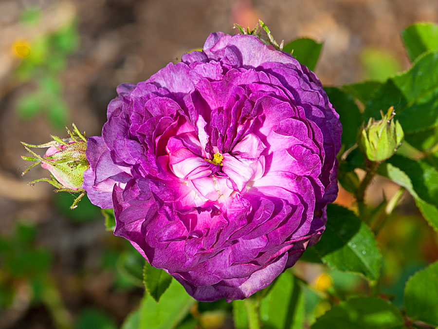
Roses look different under varying light conditions: cloudy, shade, sunrise/set, full sun. Images captured and printed may also look different for a myriad of reasons. The rose is Cardinal Richelieu.
What you see on the internet is determined by many things. An internet image will not look exactly like a printed image. Printed images are viewed in reflected light. Screen images are backlit. I strive to make them as close as possible.
Images are viewed online using computer monitors, tablets, and cell phones. Decent quality tablets and phones generally give excellent color rendition, but on rather small screens. Computer monitors allow viewing large images at larger screen resolution. That is good, but not all monitors are created equal – resolution means size, not necessarily quality.
My images are edited on a workstation with an Eizo 4k graphics monitor calibrated to 5500 Kelvin in the Adobe RGB98 color space. This is a high end graphics monitor. The typical desktop monitor is not. The monitors on my office computer are not. One is calibrated as above, the other at whatever its default settings are and 6500 Kelvin – very bright white television setting. So what?
So, your viewed image will look brighter and more ’blue’ than mine even before getting into color calibration. My two calibrated monitors are calibrated using software that presents color patches with specific values and software adjusts the monitor to reflect those values on screen. It does a great job on the Eizo monitor and something less on the office desktop. Enough technobabble.
The images are sharper on the Eizo than on the $300 Dell monitor. Surprise! The color is also subtly different.